Table of Contents
ToggleI still remember my first home project—a cramped cooking space that desperately needed an upgrade. Excited but unprepared, I dove in without a solid plan. The result? Wasted time, unexpected costs, and a layout that just didn’t work.
After combing through 400+ reader comments on Emily Henderson’s blog, I realized I wasn’t alone. From awkward cabinet placements to poor lighting choices, these missteps are common. But they’re also avoidable.
Take Sara Ligorria-Tramp’s Portland home, for example. Her thoughtful design choices transformed a tight area into a functional, stylish hub. The secret? Learning from others’ errors.
Whether you’re refreshing your space or starting from scratch, smart planning saves money and stress. Let’s turn those regrets into inspiration.
1. Skipping the Planning Phase
My friend Julie learned the hard way that skipping measurements leads to costly errors. Her flip-top cabinets left just a 1/4″ gap from the ceiling, making them impossible to open fully. A simple mock-up would’ve saved her weeks of frustration.
Underestimating Storage Needs
Sarah’s advice changed my approach: “Take inventory of your items first.” Teresa regretted her painted cabinets—chips appeared within months. Stained wood, as shown below, proved more durable for busy homes.
| Cabinet Finish | Durability | Maintenance |
|---|---|---|
| Painted | Prone to chips | High (touch-ups) |
| Stained | Resists wear | Low (occasional polish) |
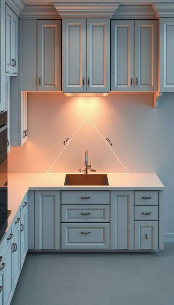
Ignoring Workflow Triangles
Broan’s research reveals the magic of the sink-stove-fridge triangle. Designer Mark Tobin insists on 42″ between countertops for smooth flow. Anything less disrupts the cooking process.
I now measure twice and remodel once. A little planning prevents big regrets.
2. Overcrowding Your Kitchen Layout
Bry’s kitchen renovation taught me how inches matter—her oversized drawers became a daily obstacle. What seemed like a minor design flaw turned into a constant battle for space. Her story isn’t unique; Yale Appliance found 37% of renovators regret their appliance placement after completion.
Misjudging Traffic Flow
Bry’s 48″ drawers blocked pathways, forcing her to sidestep like a crab while cooking. ADA standards recommend 32″ of clearance for walkways, but even wider is ideal for busy households. I now map out high-traffic areas near sinks and stoves first, leaving room for multiple cooks.
Forgetting Appliance Door Clearance
Riki learned this the hard way when her garbage disposal’s 90-degree swing collided with cabinet doors. Pull-out shelves or compact appliances solve this issue. For entertainers like KD, stacking two dishwashers saved her from a nightly dishwashing marathon.
3. Choosing Style Over Functionality
Leslie’s kitchen makeover turned into a nightmare when water seeped into her MDF cabinets. Swollen panels and a $2,500 replacement bill taught her that looks shouldn’t trump practicality. Whether you adore sleek white finishes or open shelving, balance aesthetics with real-life use.
Opting for White Cabinets Without Considering Upkeep
White cabinets brighten a space, but they’re high-maintenance. Eva spends 3x more time cleaning grease spots than her neighbor with stained wood. Semi-gloss paint helps—it resists stains better than matte—but expect touch-ups every 6–9 months.
| Finish | Pros | Cons |
|---|---|---|
| White Painted | Modern, brightens small spaces | Shows wear; frequent touch-ups |
| Stained Wood | Hides scratches; durable | Limited color options |
Prioritizing Open Shelves Near Cooking Areas
Kristine’s design flaw? Dark counters and open shelves by the stove. Grease buildup dimmed her natural light by 30%, and dust settled on plates. For high-traffic zones, closed storage saves time and keeps items cleaner.
Pro tip: Place open shelves away from splatter zones. Use them for display—not daily essentials.
4. Neglecting Proper Lighting Layers
Heather’s kitchen glowed like an operating room—until she realized her lighting mistake. Six recessed cans blasted harsh light, leaving shadows on her countertops. Her $1,200 retrofit taught me: lighting needs layers to function beautifully.

Relying Solely on Harsh Overhead Lights
Nulty Lighting’s three-layer system solves this. Ambient lights set the mood, task lights brighten work zones, and accent lights add depth. Brandi learned this after replacing eight bulbs—3000K warmth felt cozy, while 4000K looked clinical.
For task areas, Yale’s survey shows 68% prefer under-cabinet lighting. Missy’s Alexa-enabled strips let her adjust brightness hands-free. No more squinting at recipes!
Forgetting Under-Cabinet Task Lighting
Heather’s regret? Skipping this layer. Dimmable LED strips are a budget-friendly fix. They brighten the room without glare and last 50,000 hours. For a smarter small kitchen decor, integrate lights into shelves or toe kicks.
Pro tip: Warm white (2700K–3000K) feels inviting. Cool white (4000K+) works for modern spaces. Test samples at night—the way light behaves changes after sunset.
5. Poor Ventilation Choices
Eva’s kitchen smelled like last night’s stir-fry for days—until she upgraded her ventilation system. Many homeowners underestimate how crucial airflow is, especially with high-output ranges. Broan’s research reveals cooking can spike indoor pollution 5x above safe levels without proper exhaust.
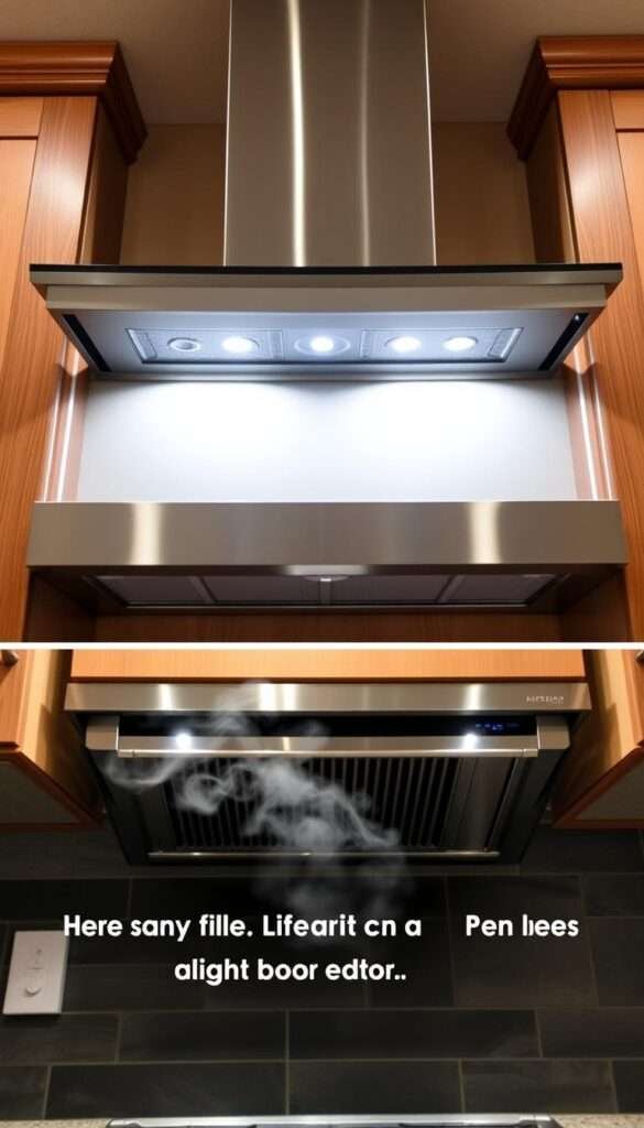
Installing Weak Downdraft Vents for High-Output Ranges
Eva learned her downdraft vent captured only 30% of smoke from front burners. For pro ranges, 600+ CFM (cubic feet per minute) is ideal. External blower models, though pricier, reduce noise and boost efficiency.
Placing Stoves on Islands Without Hoods
Massachusetts’ 2024 codes now require make-up air dampers ($1,200–$4,500) for island hoods. Without them, powerful vents can backdraft carbon monoxide. Eva’s designer insisted on a ceiling-mounted hood—now her home stays smoke-free, even during holiday feasts.
Ventilation isn’t just about appliances; it’s a safety process. Plan for airflow early in your design to avoid costly retrofits later.
6. Cutting Corners on Materials
Amy’s marble countertop turned into a science experiment when lemon juice left permanent etch marks. Like her, many homeowners regret choosing looks over durability. The right materials can save you time, cost, and daily frustration.
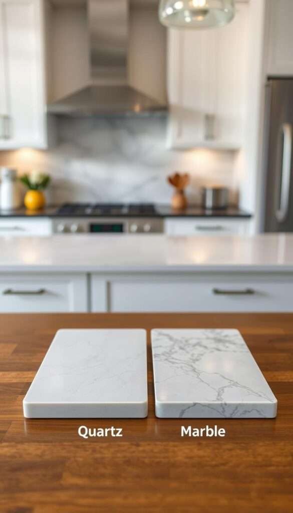
Selecting Porous Countertops for High-Use Areas
Marble scores just 3–4 on the Mohs hardness scale. Amy’s $95/sqft sealing budget couldn’t prevent stains. Quartz (rating 7) resists acids and scratches better. For busy kitchens, it’s a smarter long-term investment.
Lynn’s black granite showed every fingerprint. She spent 20 extra minutes daily wiping dust. Dark surfaces demand upkeep—lighter quartz or soapstone hides flaws better.
Using MDF Near Sinks Without Sealing
MDF cabinets swell like sponges near water. KD learned this after her sink splash zone warped. Solid wood or plywood with waterproof seals work better. Full-height backsplashes also shield walls from moisture.
Pro tip: Test materials before committing. Press a lemon wedge or drop water on samples. If it stains or swells, rethink your choice.
7. Ignoring Electrical and Outlet Needs
Rebecca’s phone died mid-recipe when she realized her kitchen lacked accessible outlets. Like her, many homeowners underestimate how outlet placement impacts daily life. A well-planned electrical design keeps appliances charged and workflows smooth.

Not Adding Pantry or Island Outlets
HKW regretted skipping outlets in her pantry. Her blender’s cord barely reached the nearest plug, forcing awkward space adjustments. NEC 210.52 mandates outlets every 4 feet—but islands and pantries often get overlooked.
Rebecca’s solution? Pop-up outlets ($175–$300) hidden in countertops. They’re sleek, safe, and perfect for charging items like tablets or mixers. For islands, consider side-mounted plugs to avoid cord clutter.
Overlooking Smart Home Integration
Rusty’s contractor suggested whole-home surge protection—a lifesaver during storms. Smart outlets with USB ports also future-proof your kitchen. They handle voice commands and schedules, ideal for slow cookers or coffee makers.
Plan outlets early. Label them by function (e.g., “appliance zone” or “charging station”). A little foresight keeps your design flexible and functional for years.
8. Failing to Future-Proof Your Design
Sheila’s passion for universal design changed my perspective on longevity. While renovating her house, she insisted on features that would work for her family across generations. That foresight paid off when her parents moved in years later. A kitchen should evolve with your life, not hold you back.
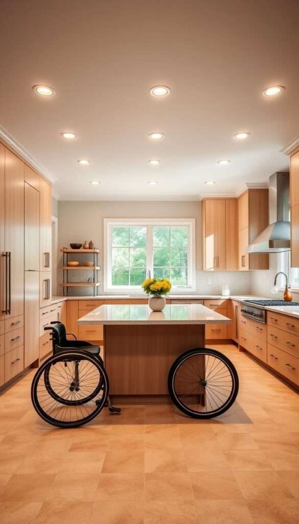
Overlooking Accessibility Features
Kathryn’s $12,000 mistake? Ignoring ADA standards. Her stunning waterfall counters were too high for comfortable prep work. Now she swears by these measurements:
- 34-inch counter height accommodates seated users
- 36-inch wide pathways allow wheelchair access
- Pull-down shelves replace hard-to-reach cabinets
Sheila’s multi-gen hosting stats prove smart design matters. Her adjustable island serves toddlers and grandparents equally well.
Choosing Trendy Finishes That Date Quickly
Kate’s turquoise window treatments looked fresh in 2015—by 2020, they screamed “dated.” Studies show certain finishes lose appeal within 5-7 years. For lasting style:
- Shaker cabinets outlast ornate profiles by decades
- Neutral backsplashes pair with bold, replaceable accents
- Quartz counters resist both stains and design fatigue
My vision now prioritizes flexibility. Classic foundations with swappable decor keep spaces feeling current without full remodels.
Pro tip: Test finishes in natural light. What looks chic under showroom LEDs might feel overwhelming in your actual space.
9. Hiring the Wrong Contractor
Greta’s HVAC disaster became my masterclass in subcontractor screening. Her “licensed” technician vanished after botching ductwork, leaving $8,200 in repairs. Like 23% of renovators (NAHB data), she learned that contractor choices make or break a project.
The Hidden Dangers of Unvetted Teams
Katie’s construction loan turned into a 93A lawsuit when her GC hired uninsured electricians. One injury later, she faced $37,000 in medical bills. Now I always ask:
- Proof of insurance for all subs (workers’ comp + liability)
- Lien waivers to prevent surprise claims
- Previous client referrals for specialty trades
Why Lowball Bites Back
That “$25,000 kitchen quote” often masks hidden cost. Tara’s GC explained how bids 15% below market typically:
- Use inferior materials (MDF instead of plywood)
- Skip permit pulls ($1,200 average)
- Charge change orders mid-work
Her 3-phase payment structure kept the budget intact:
| Phase | Payment | Milestone |
|---|---|---|
| 1 | 10% | Permits approved |
| 2 | 25% | Rough inspections passed |
| 3 | 15% | Final walkthrough |
Pro tip: Builder’s risk insurance covers theft and damage during renovations. For $500–$900, it protects against most surprises.
Your Dream Kitchen Starts With Avoiding These Pitfalls

Caitlin’s architect had one golden rule: “Build for your lifestyle.” That simple advice shaped my entire design approach. From Ellen’s prep sink success to Emily’s reader insights, avoiding common errors saves 17–34% on costs.
The top regrets? Poor lighting, weak ventilation, and trendy finishes that date fast. Smart choices—like quartz counters and layered lighting—keep your home functional for years.
Grab our free renovation checklist to streamline your process. As Tara says, “Quality work costs money, but mistakes cost more.” Stay true to your vision, and that dream kitchen will be worth the wait.