Table of Contents
ToggleWalking into a thoughtfully designed home feels like taking a deep breath. It’s not just about empty surfaces or rigid rules—it’s about crafting a space that works for you. Too often, we fall into the trap of replicating trends without considering how they fit our daily lives.
Good interior design balances beauty with function. Instead of copying staged photos, ask: Does this layout make my mornings easier? Can I relax here after a long day? Tactile comfort—like Caroline’s favorite linen throws or Alvhem’s cozy seating—matters more than Instagram-ready perfection.
Measurements matter, too. A sofa that overwhelms your living room or a rug that’s too small can disrupt harmony. As experts note, quality pieces that reflect your personality outlast fleeting trends. Let’s explore how to sidestep common pitfalls and create a home that’s both serene and soulful.
Overdoing the All-White Aesthetic
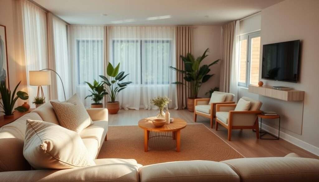
White walls can make a space feel clean, but too much white can feel lifeless. While it’s a popular choice for its airy look, monochromatic schemes often ignore the need for contrast and warmth.
Why Too Much White Feels Cold
White walls without variation can disrupt hygge principles—think Casamaiscasa’s clinical spaces. Light bounces harshly off surfaces, amplifying sterility. Even Scandinavian design, known for whites, balances with wood tones.
How to Warm Up Neutral Tones
Swap stark whites for warm beiges or creams. Paula Silvagni Interiors uses leather and marble to add tactile depth. Here’s a quick guide to adjusting your palette:
| Cool Whites | Warm Neutrals |
|---|---|
| Bright, blue undertones | Yellow/peach undertones |
| Feels expansive | Feels cozy |
| Pairs with metallics | Pairs with wood |
Layer textures like knitted throws (Everlasting Comfort) or gilded sconces. Alvhem’s oak furniture softens white rooms, while Kapunu Home stacks linen and jute for dimension.
Finally, accent walls in terracotta or sage add just enough color without clutter. Your room’s vibe should reflect your style, not a catalog.
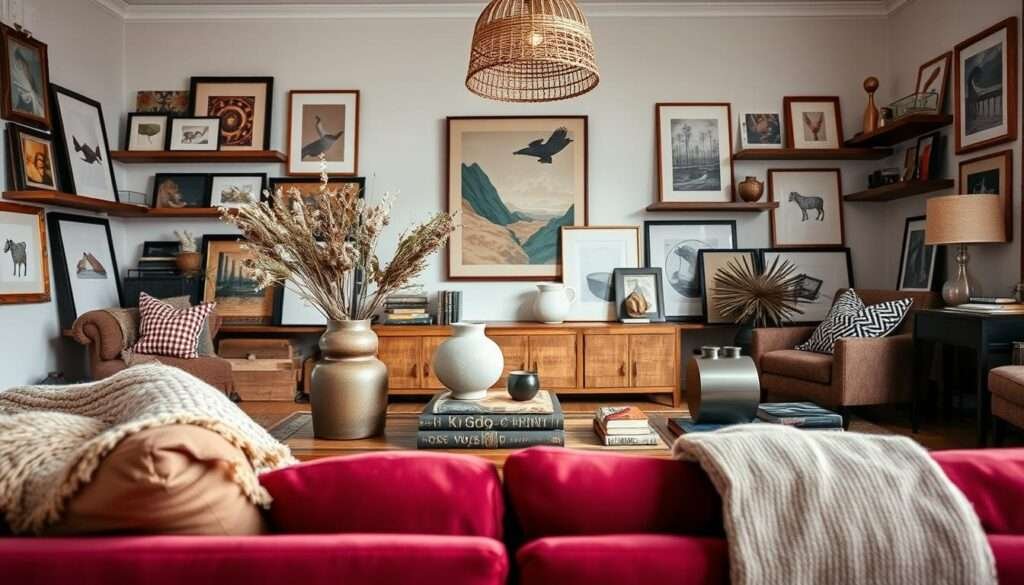
Neglecting Texture and Layers
Texture transforms a house into a home—soft, rough, or smooth surfaces invite touch and warmth. A room stripped of layers feels sterile, no matter how sleek the furniture. Caroline’s fabric philosophy proves this: her linen throws turn movie nights into cozy rituals.
The Role of Tactile Materials
Tactile materials improve relaxation. Think velvet chairs that hug you or clay candle holders that catch flickering light. The 24KF velvet accent chair, for instance, adds luxury without sacrificing comfort.
Easy Ways to Add Texture
Contrast smooth marble with earthy jute rugs. Henn&Hart’s brass coffee table becomes a focal point, while RYB velvet curtains add vertical depth. Transformation Avenue’s projects show how balanced decor defines a space’s personality.
Here’s a quick cheat sheet:
- Soft: Fluffy rugs, knitted throws (Everlasting Comfort)
- Rough: Woven baskets, raw wood shelves
- Shiny: Gilded sconces, Henn&Hart’s metallic finishes
Mix these to cozy up a room without clutter. Your design should whisper, not shout.
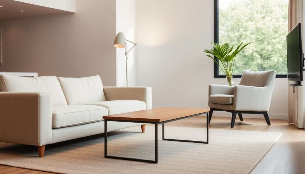
Ignoring Functional Furniture
Furniture should serve your life, not just fill space. Too often, we pick pieces that look stunning but fail in daily use. The Mendelson Group notes oversized sectionals cramp small spaces, while armchairs offer flexibility.
Choosing Style Over Comfort
Showroom-matched sets lack personality and practicality. Silo Studios proves statement art can balance beauty and function. Arterberry Cooke’s storage coffee tables hide remotes and magazines elegantly.
Multi-Purpose Pieces to Consider
Smart design solves multiple needs. Sarah Szwajkos uses ottomans with hidden storage for extra seating. Tamarack Builders’ TV consoles keep clutter out of sight.
- Flexible seating: Allito Spaces’ sofas fit proportions perfectly.
- Low-maintenance decor: Flybold’s faux plants add greenery without upkeep.
- Vertical solutions: Wall-mounted shelves free up floor space.
Your home deserves furniture that adapts—not just adorns.
Poor Lighting Choices
Lighting can make or break the mood of your home—like a dimmer switch for daily life. Harsh overhead lighting flattens a room, while layered light sources add warmth and function. Sarah Tract Interiors proves that balance is key.

Relying Solely on Overhead Lights
Single-source lighting casts unflattering shadows and feels clinical. The London Homefix notes that recessed ceiling lights alone lack the flexibility for reading or relaxing. Think of it like wearing only a winter coat—no layers for changing needs.
How to Layer Lighting Effectively
A three-tier approach works best:
- Ambient: Soft recessed lights or chandeliers (Sarah Tract’s pick).
- Task: Adjustable table lamps or Reid Rolls’ slim floor lamps.
- Accent: Wall sconces or Philips Hue smart bulbs for mood.
Gold planter pots or mirrored surfaces amplify natural light. For small spaces, Henn&Hart’s vertical sconces save floor space. Your design should adapt to your life, not the other way around.
Pushing Furniture Against Walls
Arranging furniture is like choreographing a dance—every piece needs room to breathe. Yet, many shove sofas and tables against walls, thinking it saves space. This actually makes a room feel rigid and disconnected.
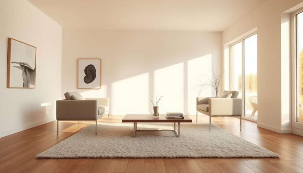
Why This Limits Flow
Wall-hugging layouts disrupt natural movement. NativeHouse Photography shows how floating furniture creates an airy feel. Kristen Keyes Interiors proves even 12 inches of clearance behind a sofa improves traffic flow.
Alvhem’s lounge bed layout demonstrates balance—centered pieces invite conversation, not awkward sidestepping.
Better Furniture Arrangement Tips
Debunk the “more floor space” myth: Empty centers feel larger, not cramped. Try these tricks:
- Leave 18″–24″ behind sofas for walking paths (JAM Interiors’ rule).
- Use U-shaped groupings for chats, L-shaped for open designs.
- Elevate drapery to ceiling height (Meghan Jay’s trick) to draw eyes up.
Vertical storage, like Henn&Hart’s shelves, frees floor space. Your room should guide movement—not block it.
Forgetting Vertical Space
Walls do more than hold up ceilings—they can redefine your entire space. Ignoring vertical areas wastes opportunities for storage and style. The Mendelson Group proves even small rooms gain function with wall-mounted consoles.
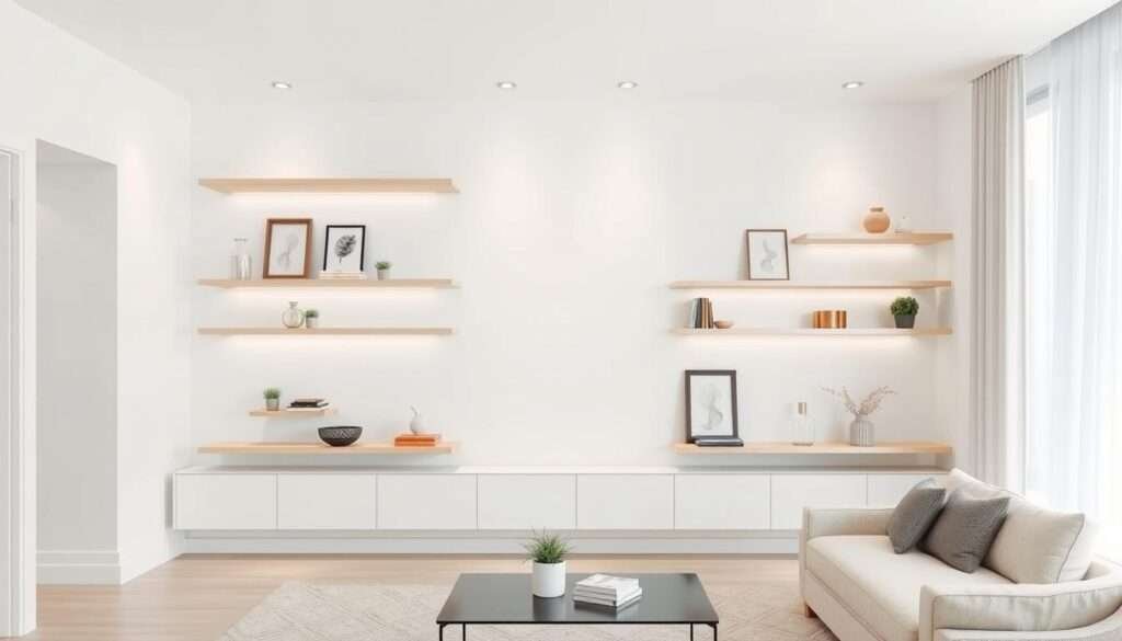
Utilizing Walls for Storage and Decor
Floating shelves turn blank walls into functional art. Tory Williams uses reclaimed wood shelves to display books and plants. For tighter spaces, Kimberley Kay Interiors suggests narrow peg rails for keys or hats.
Floor-to-ceiling drapery (Meghan Jay’s trick) elongates rooms. Pair with Henn&Hart’s brass rods for a polished look. Vertical greenery, like Etsy’s faux olive trees, adds life without clutter.
Vertical Design Ideas
Choose between gallery walls or bold statement pieces. Marc Mauldin’s oversized canvas draws eyes upward, while Arterberry Cooke’s staggered frames create rhythm. Here’s how to pick:
| Gallery Walls | Statement Art |
|---|---|
| Multiple small pieces | One large focal point |
| Ideal for narrow halls | Works in open layouts |
| Mix photos and objects | Requires careful placement |
For more small-space hacks, explore functional kitchen design. Remember: your walls are tools, not just boundaries.
Overcrowding with Decor
A well-curated space feels intentional, not empty or overwhelming. Too many decor items can make a room feel chaotic, while too few leave it barren. My Grey Home 7’s focal point philosophy proves that one bold art piece often outshows a crowd of trinkets.

The Balance Between Minimal and Barren
Silo Studios’ “one statement piece” rule works wonders. Instead of scattering small pieces, let a single item—like Inside Stories’ oversized abstract painting—anchor the design. Domekzalasem’s space planning shows how negative space highlights what matters.
Compare these approaches:
| Cluttered Display | Curated Display |
|---|---|
| Multiple small items | One focal point + 2–3 accents |
| Visual noise | Clear hierarchy |
| Hard to clean | Easy to maintain |
Selecting Meaningful Accessories
Rotate seasonal decor to keep your space fresh. Dekorasyon Decor mixes family heirlooms with modern vases for personalized minimalism. As noted in living room design mistakes, odd-numbered groupings (3–5 items) feel organic.
Ask yourself:
- Does this spark joy? (Keep only what resonates.)
- Does it serve a purpose? (Functional decor > dust collectors.)
- Can I swap it seasonally? (Less permanence = less clutter.)
Creating a Space That Reflects You
Your home should tell your story, not someone else’s trend. Start by listing what matters most—a design manifesto. Include needs like “cozy reading nook” or “easy-to-clean surfaces.”
Small changes make big impacts. Swap one harsh light for warm bulbs, or test an accent color on a single wall. Alvhem’s adaptive layouts show how design can evolve with your life.
Reclaim your space today. Audit one room using this guide. Remove three items that don’t reflect your style. Add one that simplifies daily life. Repeat.