Table of Contents
ToggleI still remember the afternoon I painted swatches on poster boards and held them against the light in my living room. Small chips became windows into what the space could feel like, and I watched natural daylight turn warm beige into something cozy and bright.
I chose a core group of neutrals that read together across textiles and finishes. That choice softened the room, reflected daylight, and made swapping accessories simple. Those few decisions set a calm atmosphere and kept the look timeless.
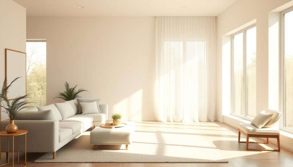
With a sleek sofa, a warm wood coffee table, and a textured rug, the living area felt balanced and practical. I tested paint on boards, mixed near-neutrals, and layered textures until the composition looked magazine-ready and lived-in at once.
Why I Always Start with Neutrals for a Calm, Spacious Living Room
My first move in any room is to pick a restrained color palette that gives me control over atmosphere and flow.
Neutrals act as a reliable backdrop. They let architectural lines, texture, and light become the focal points rather than loud colors fighting for attention.
I choose off-whites and creams when a small space needs brightening. Pale paint reflects natural light and reduces visual noise, which makes rooms feel larger without extra furniture.
- I start with a simple scheme and add color through art, pillows, and throws later so the room can change seasonally.
- I consider undertones early so tones work with floors, countertops, and built-ins.
- I test paint swatches on multiple walls and observe them in morning and evening light before I commit.
By planning sight lines and traffic patterns, I ensure the living area flows into adjacent rooms with tonal continuity. That restraint creates emotional ease and a timeless base for everything I layer on.
Mastering Undertones: Warm, Cool, and Near-Neutral Shades That Set the Mood
A room’s mood often hinges on the subtle tint hiding in paint chips and textiles. I look for that tint first, because it guides every next choice and keeps the look calm and collected.
Reading undertones in paint, fabrics, and finishes
I compare chips side by side and hold them against fixed finishes like flooring, stone, and upholstery. That reveals sneaky blue or red casts in gray and near-whites.
Choosing a dominant undertone and the 80-20 balance
I pick one dominant undertone—warm or cool—then follow an 80-20 rule. About 80% of surfaces repeat that undertone and 20% contrast for depth. I note favorites like Benjamin Moore Swiss Coffee and Sherwin-Williams Alabaster for warmth, and White Dove or Oyster White for soft off-white versatility.
Warm versus cool in natural and artificial light
Warm neutrals (tan, ivory) draw from red and yellow. Cool neutrals (taupe, cool white, charcoal with blue) lean blue or green. I test large samples through the day because bulbs and north light shift perception. When a space reads too cool, I add warm textiles; when it’s too warm, I introduce cool stone or metal for balance.
| Undertone | Examples | Effect in Room |
|---|---|---|
| Warm | Swiss Coffee, Alabaster | Cozy, inviting; complements warm wood |
| Cool | White Dove, Oyster White, blue-leaning gray | Crisp, gallery-like; pairs with stone and steel |
| Near-neutral | Desaturated off-whites | Flexible backdrop; shows subtle hue shifts |
Texture Is My Secret to Visual Interest in a Neutral Space
Texture is the element I reach for when quiet colors need life. I use tactile layers so the scene feels inviting and photoreal, not flat.
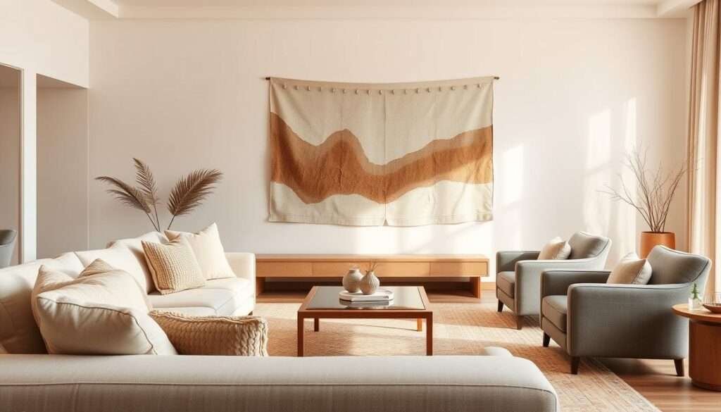
Layering soft textiles—linen slipcovers, wool throws, boucle pillows, and a nubby rug—adds instant warmth and invites touch. I style a sleek sofa with these pieces and place a warm wood coffee table nearby for contrast.
Mixing materials
I balance wood, stone, leather, and woven fibers so neutral tones gain depth through contrast. Architectural textures like beams or paneling add dimension even when the color stays restrained.
Adding subtle shine
I keep metal finishes mixed but coordinated: brushed brass, antique bronze, and satin nickel for a refined sheen. Small accessories—ceramic vessels and textured trays—enrich the palette without clutter.
- I vary weave scale from fine to chunky so the palette reads layered.
- I ground the composition with a soft textured rug that also absorbs sound.
- I photograph vignettes in natural light to check that texture provides the visual interest I want.
| Element | Example | Effect | Placement |
|---|---|---|---|
| Soft textiles | Linen, wool, boucle | Warmth, touchable depth | Sofa, pillows, throws |
| Hard materials | Wood, stone, leather | Contrast, structure | Coffee table, side table |
| Finishes & accessories | Brushed brass, ceramics | Subtle shine, curated detail | Lighting, trays, vessels |
Light First, Color Second: How I Use Natural and Artificial Light to Guide the Palette
I begin every repaint by watching daylight play across large swatches tacked high on different walls. That ritual shows me how hues bend with morning sun, midday glare, and evening glow.
Sampling paints on the wall and watching them through the day
I tape big paint samples on at least three walls and check them at sunrise, noon, and dusk. North-facing windows cool grays and off-whites, while west light warms them dramatically.
Building layers of ambient, task, and accent lighting for warmth
I rely on a three-layer plan:
- Ambient: soft overhead lighting on dimmers.
- Task: table and floor lamps for reading and sofa zones.
- Accent: sconces or spotlights to highlight texture and lines.
I choose bulbs around 2700–3000K so neutrals read intimate at night. I check sofa fabric and rug under lamps, revisit walls at twilight, and fine-tune color until the room feels calm in person and in photos.
For more inspiration on cozy interiors, see this cosy cottage kitchen ideas.
| Element | Role | Tip |
|---|---|---|
| Paint samples | Test hues | Observe morning and evening |
| Bulb temperature | Set mood | 2700–3000K for warmth |
| Lighting layers | Add depth | Ambient, task, accent on dimmers |
Foundational Choices: Walls, Sofa, Rug, and Coffee Table That Anchor the Scheme
My rooms take shape once I lock in walls, sofa, rug, and a central table. Those four elements set scale, flow, and mood for everything else.
I start with off-white walls so light bounces and the space feels larger. Off-white provides a calm baseline for the entire color palette and makes testing paint and undertones easier.
My go-to combinations
I pick a greige sofa next. Greige is a true combination of gray and beige that adapts as daylight shifts. It links warm neutrals and cooler tones without fighting them.
A textured rug anchors seating, adds comfort, and absorbs sound. I then add a warm wood coffee table for organic warmth and tactile contrast with soft fabrics.
- I confirm undertones across paint, sofa fabrics, and rug shades so big elements harmonize.
- I repeat wood on side tables or picture frames so the palette reads cohesive.
- I limit foundational colors so the room feels edited and restful, then add one subtle accent like a stone tray.
| Element | Role | Tip |
|---|---|---|
| Walls | Reflect light, expand space | Off-white for a serene baseline |
| Sofa | Anchor seating | Greige for versatile tones |
| Rug & Table | Texture and warmth | Textured rug plus warm wood table |
Finally, I verify the look in daylight and lamplight and document finishes. That protects the integrity of the palette when I update colors or materials later.
How to Use a Neutral Color Palette to Create a Calming Living Room with Accents
I start by imagining a quiet corner where pillows and art quietly converse. A neutral scheme serves as a soft backdrop, letting texture and shape carry the mood.
Adding personality with pillows, art, and throws
I add personality through tonal pillows, art, and throws that echo the palette so the room stays serene. I edit pillow choices down to a tight set and mix textures like linen, cashmere, and boucle for depth.
Accessories are sparse and meaningful. I choose one or two pieces with strong texture rather than many small items. That keeps sight lines clean and the space restful.
When to introduce a single pop of color for focus and tension
I let one statement element — a bold artwork or a saturated vase — deliver focus without chaos. I repeat that accent in tiny doses across the room so the composition feels intentional.
- I balance warm and cool accents in small amounts to add visual interest while respecting an 80-20 calm rule.
- I photograph vignettes to confirm the scene reads balanced and Pinterest-friendly.
| Element | Role | Why it works | Placement |
|---|---|---|---|
| Pillows & Throws | Soft layering | Adds touch and depth without color noise | Sofa, armchair |
| Statement Art or Vase | Focus point | Creates tension and direction | Above mantel or on coffee table |
| Scattered Accessories | Finishing details | Repeats accent and ties scheme | Shelves, side tables |
For further neutral makeovers and practical examples, see this neutral makeovers.
Architectural Details and Focal Points that Elevate Minimalist Design
Architectural detail gives structure; it lets the palette breathe and feel refined. Quiet walls become an intentional backdrop when I add crown, paneling, or a single exposed beam.
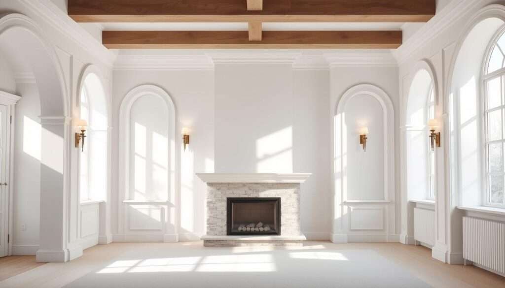
Crown, paneling, and beams that add depth
I add crown or board-and-batten to calm walls so the neutral color palette reads rich without bolder colors. Wainscoting or shiplap gives texture that casts soft shadows and adds visual interest.
Beams or an archway draw the eye up and make the space feel larger. I repeat warm wood on a mantel or stair detail so materials and colors thread through the scheme.
Creating a focal point: fireplace, statement lighting, or art
I choose one statement element—a refined fireplace, a sculptural light, or oversized artwork—to organize the room. That single anchor gives the eye a place to rest and preserves calm in negative space.
I use paint sheen strategically: matte hides imperfections, eggshell highlights texture. I align accent lighting to graze paneling and spotlight the focal point so details photograph cleanly.
- I keep the scheme tight so every line and junction feels intentional.
- I pick a restrained fixture that enhances, not overwhelms, the interior.
- For farmhouse detail inspiration, I reference a simple schema from this farmhouse detail inspiration.
| Element | Benefit | Material choice | Placement |
|---|---|---|---|
| Crown & Paneling | Adds depth without stronger colors | Painted trim, board-and-batten | Perimeter walls, behind seating |
| Beams & Archways | Raise sight lines; increase scale | Exposed wood, plaster arch | Ceiling, room transitions |
| Focal Point | Organizes visual flow | Fireplace, pendant light, large art | Center wall, mantel, or above console |
| Paint Sheen & Light | Defines texture and mood | Matte or eggshell; warm bulbs | Throughout; accent grazing on details |
Pin-Worthy Polish: My Styling Checklist for Simplicity, Balance, and Warmth
I cap the process with a simple checklist that guarantees warmth and photographic polish.
I edit the room in layers: remove extras, then add back only what enhances balance and style.
I keep a short list—cohesive palette, aligned undertones, layered lighting, and varied texture for depth.
I play with tones and tints of the same color so the scheme feels nuanced without getting busy.
I add just a few accessories that earn their place and one restrained pop—perhaps a soft blue book jacket or gray stone bowl—for quiet contrast.
I confirm paint, textiles, and finishes look right together in photos and in person under evening lamps, then photograph from several angles so the living room reads serene, spacious, and truly pin-worthy.


